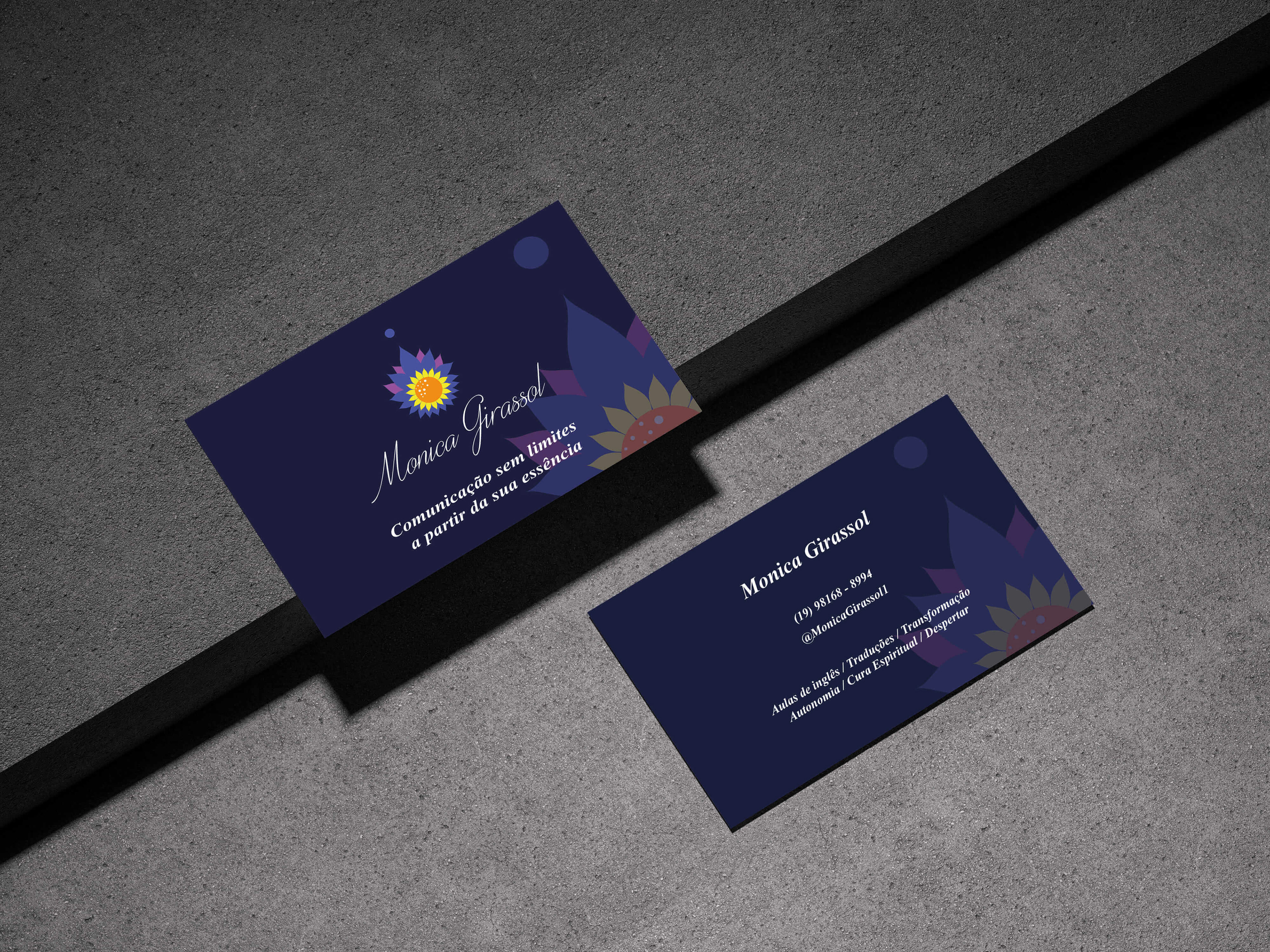
Monica Girassol's endeavours extend far beyond the realms of the ordinary, transcending human limitations to merge seamlessly with the transcendent. As a practitioner of healing arts and English education, she had a profound desire for her visual identity to echo the fluidity and depth inherent in her work and company.
Many concepts were developed and explored each one aiming to capture the essence of her practice. We got to an idea that resonates with the profound themes of spiritual integrative healing, liberation, transformation, heightened awareness, the dissolution of barriers, and the expansive consciousness of the universe itself. In this unified expression, Monica Girassol's visual identity finds its perfect reflection, inviting all who encounter it to journey alongside her.
THE PROCESS
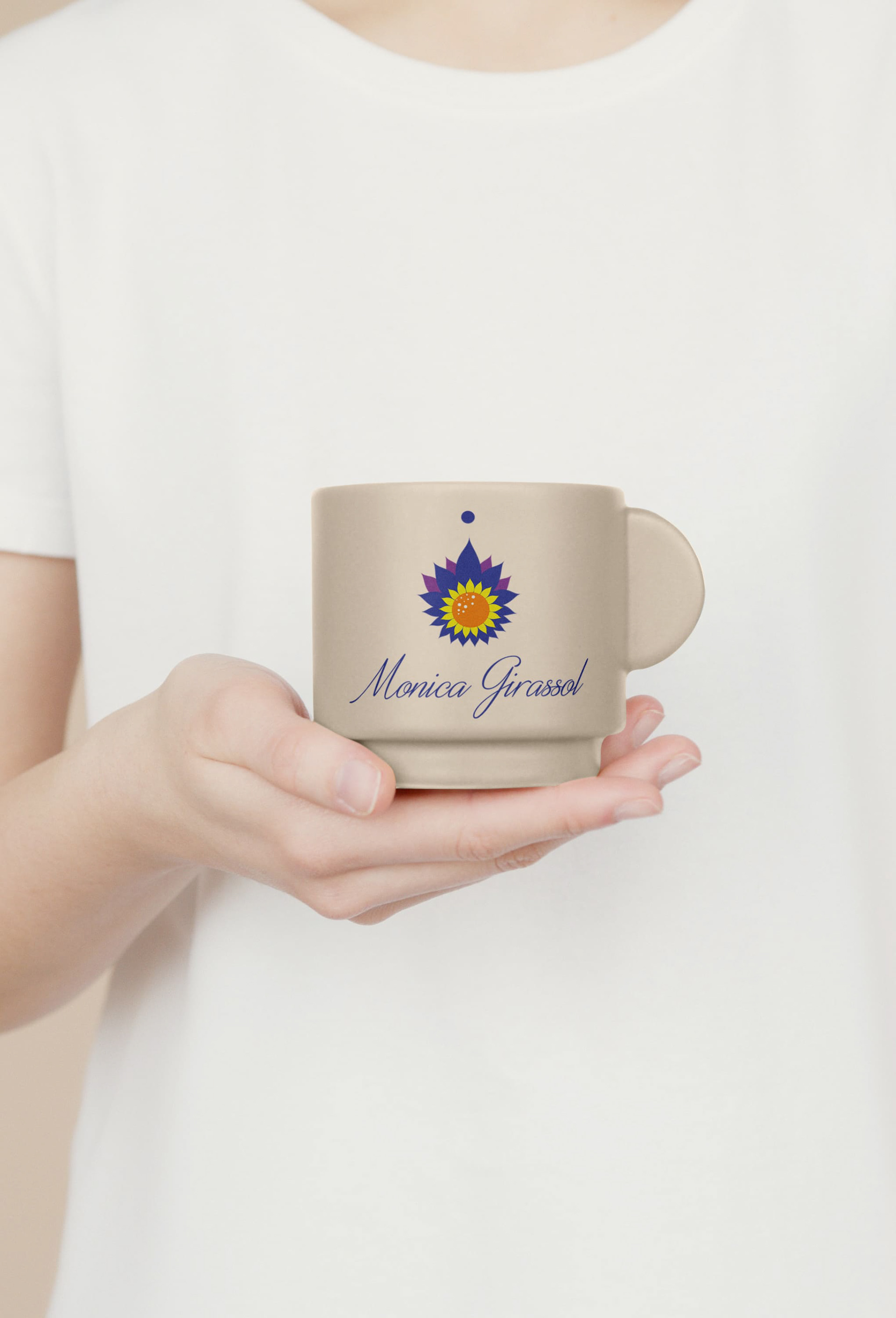
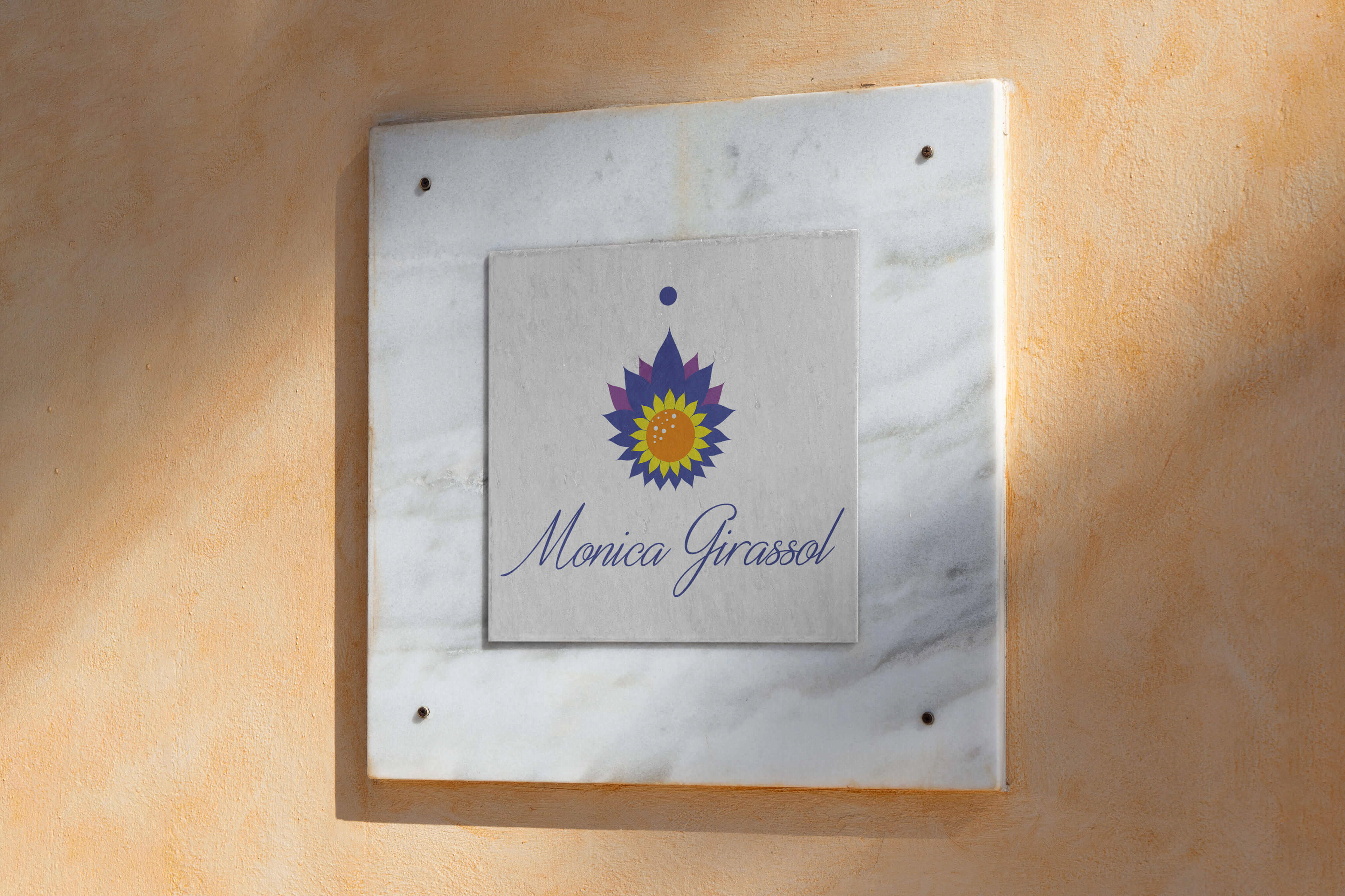
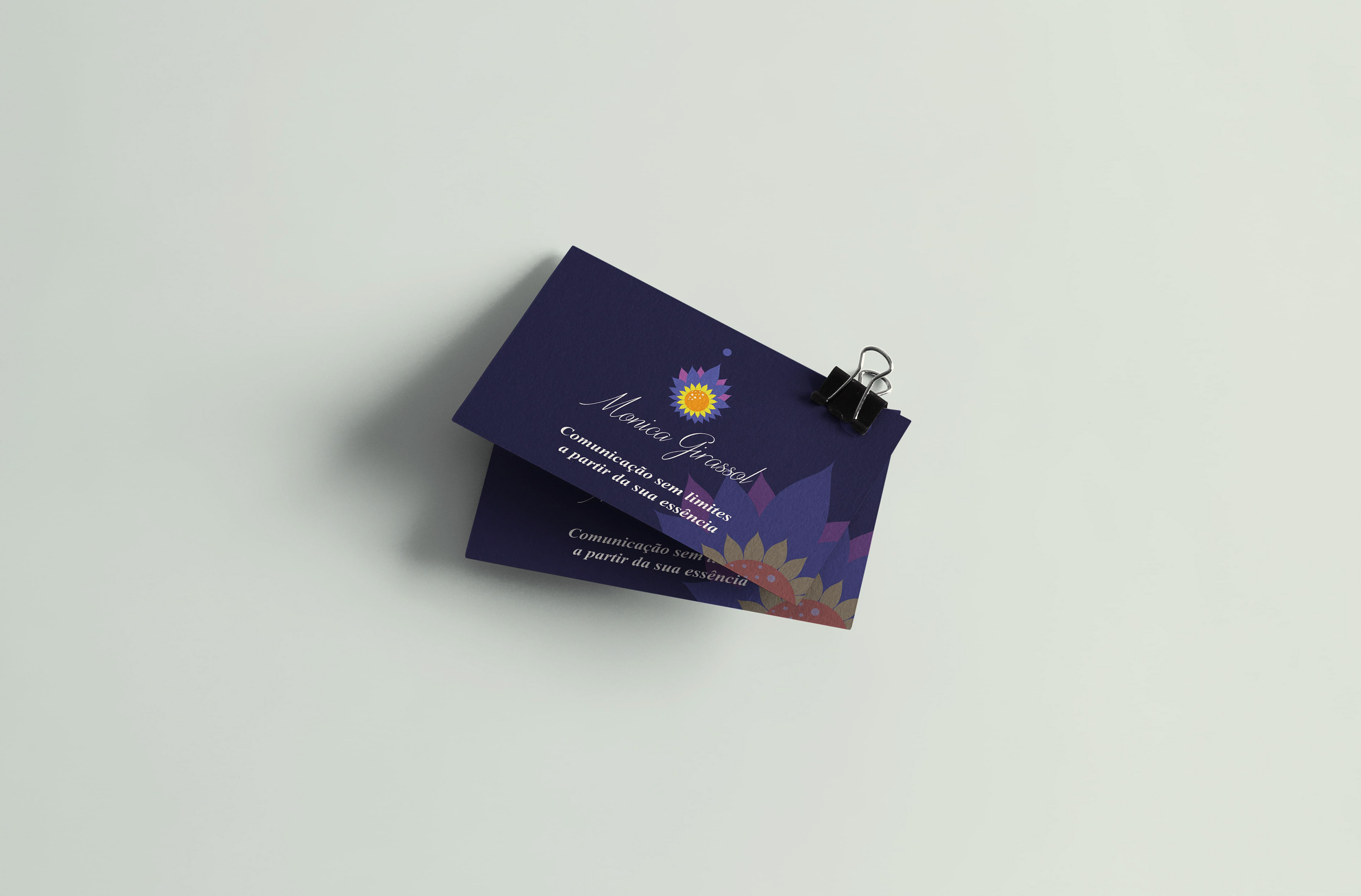
The logo created serves as a visual embodiment of a journey towards transcendence, symbolizing ascension, harmony with the cosmos, existence, liberation, essence, inspiration, evolution, growth, and the realization of one's higher Self. The brand typography was chosen based on Monica Girassol's handwriting, and at its core lies the symbolic sunflower, representing not only the personal essence of the brand but also the innate essence of its namesake, where "girassol" means "sunflower".
The colours were carefully chosen to represent the concepts and values of the brand. In totality, the visual identity is a testament to Monica Girassol's philosophy and practice, inviting individuals to embark on a journey of self-discovery and growth.


SOCIAL MEDIA MANAGEMENT
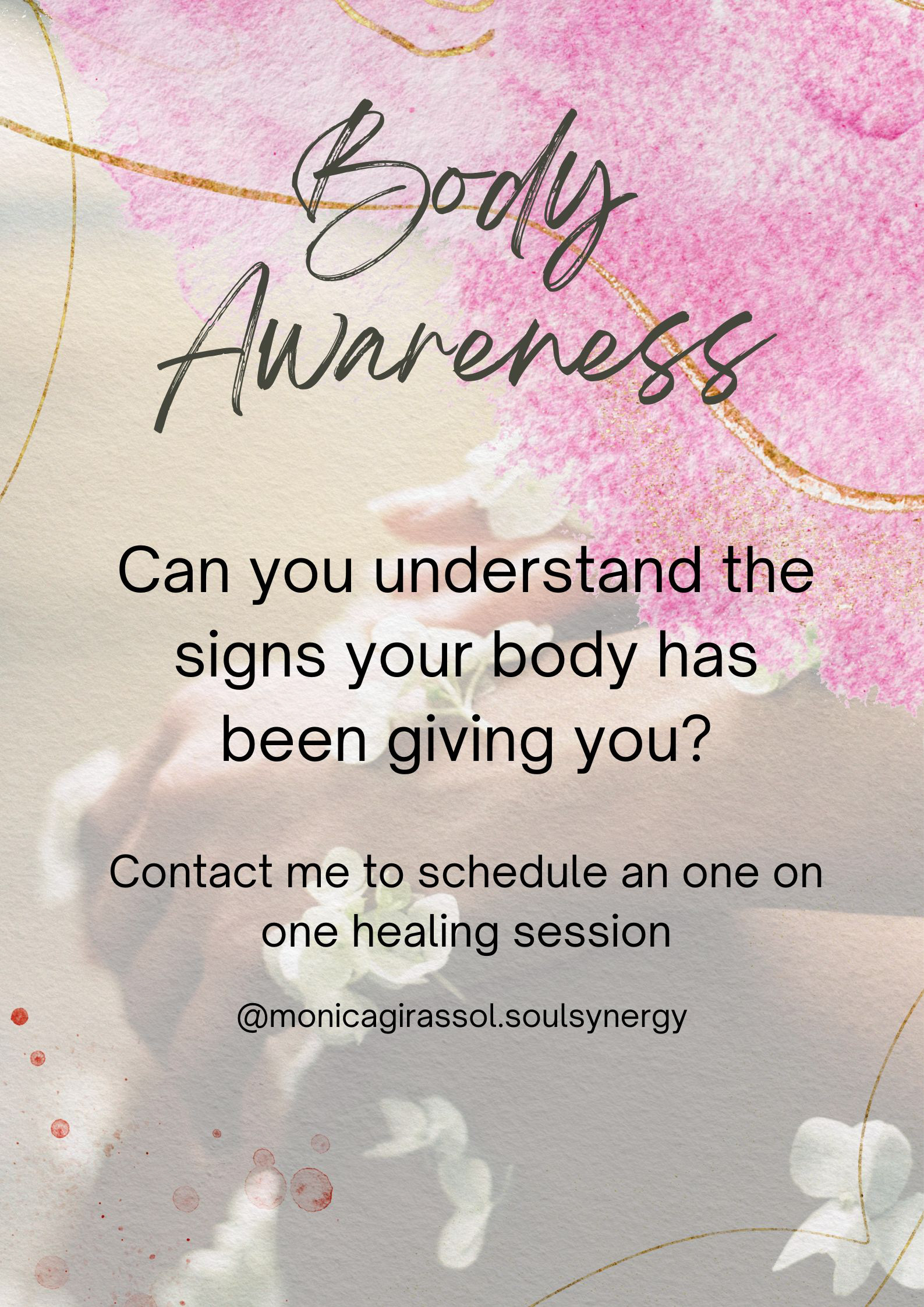
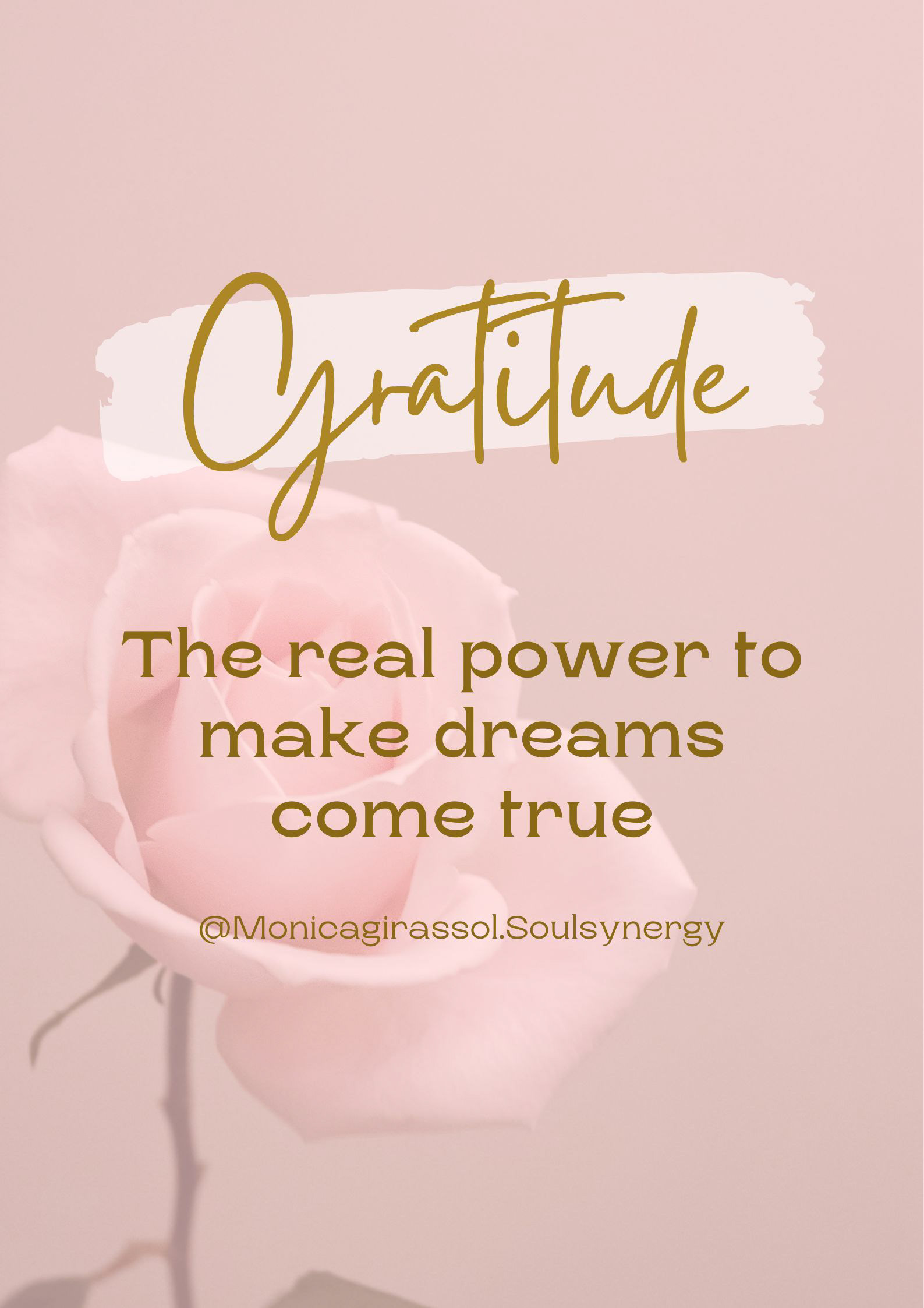
INSTAGRAM POSTS DESIGN


